The winter season is not just about the holidays and colder weather; it's also the perfect time for festive formal winter events that call for dressing up in style. Whether you're attending a winter ...


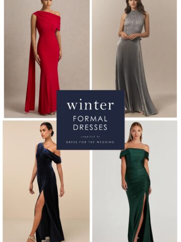
The winter season is not just about the holidays and colder weather; it's also the perfect time for festive formal winter events that call for dressing up in style. Whether you're attending a winter ...
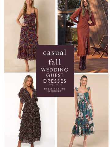
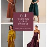
Informal fall weddings give guests a chance to dress up in a more relaxed autumnal way. You'll want to strike a balance between being festively dressed for the wedding and wearing fall-weight ...
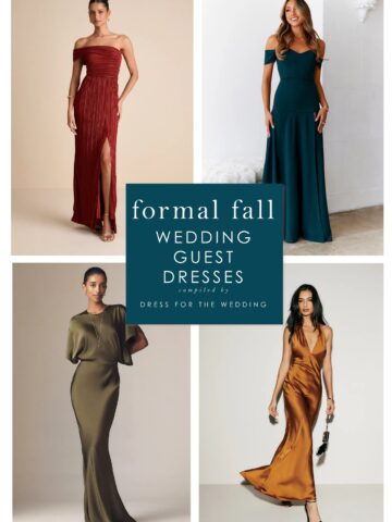
If you have a formal black tie wedding to attend this fall or winter, this post is full of ideas for what to wear to ace the dress code of black tie or formal attire in colors and styles of the ...
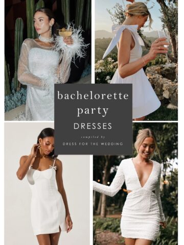
The countdown to your wedding is on, and you're about to celebrate by saying goodbye to single life with a bachelorette party. If the date is set for your bachelorette, but you still need the perfect ...
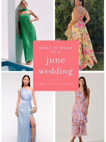
This shopping guide is full of ideas for what to wear to a June wedding. We've selected over 90 dresses that we think are perfect to wear to a wedding in June. Our ultimate guide to dressing for early ...
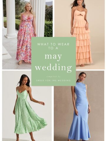
May weddings are the start of the busiest part of the wedding season. If you're wondering what to wear to a wedding in May, this post will help! What to Wear to a May Wedding Are you wondering what ...
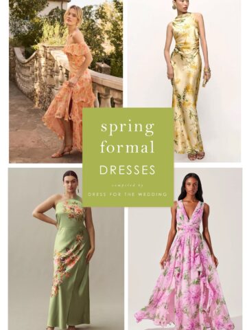
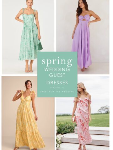
Spring is usually the start of the next wedding season and the time of year when you'll start to see the wedding invitations roll in with invitations for April, May, and June weddings. While many ...
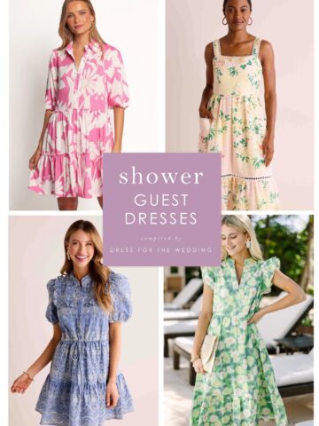
Today, we'll answer the question: What should you wear to a bridal shower as a guest? If you are invited to a wedding shower this spring or summer, you might be wondering what to wear to a bridal ...
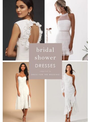
Your bridal shower is often one of the first pre-wedding parties you'll celebrate as a bride-to-be! As the guest of honor, you might be seeking a pretty dress or outfit to wear to your bridal shower. ...
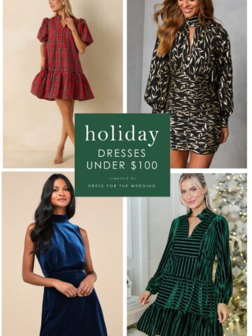
Get ready for the festive season for less! If you have celebrations to attend or are just having fun at home, we found some gorgeous party dresses for the holidays, all under $100! The holidays are ...
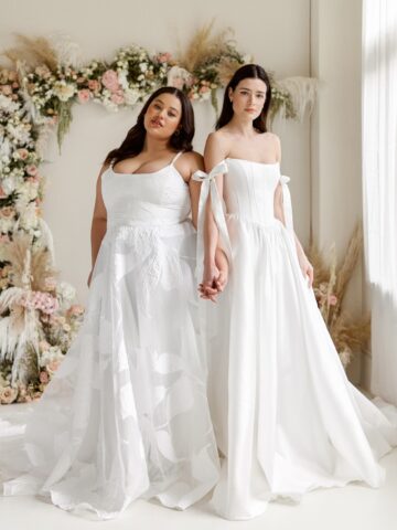
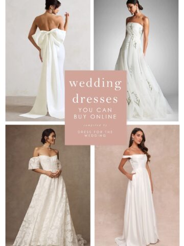
Each time we see a wedding dress from the Truvelle 2025 Collection in our Instagram feed, we immediately stop our scroll, and we simply can't hit that like button fast enough! There's something about ...
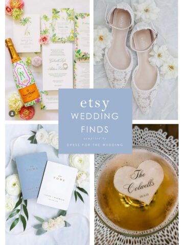
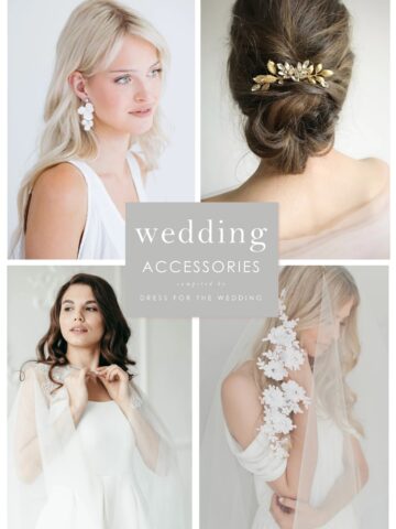
We all know Etsy has some amazing shops and unique finds for your wedding. The selection of custom wedding invites, on-trend wedding decor, one-of-a-kind items, wedding accessories, and wedding party ...
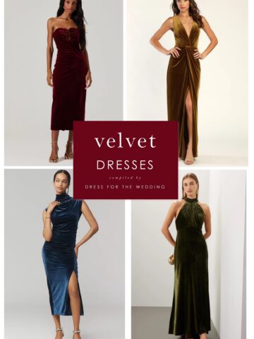
The rich, plush feel of velvet is one of the best parts of cold-weather holiday dressing. We've collected the prettiest gorgeous velvet special occasion dresses that we could find to help you get ...
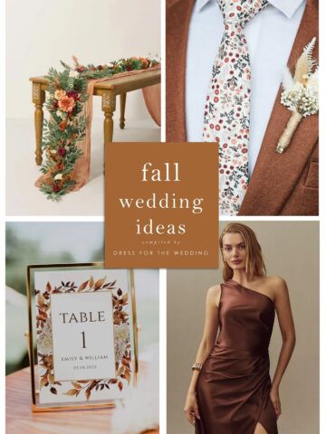
Fall is becoming the prime season for weddings. If you're planning on holding your wedding during the fall months, we've created this helpful guide to some of our favorite finds for fall floral ...
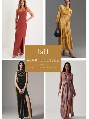
With long hemlines and a variety of sleeve and silhouette options, maxi dresses are a perfect wedding outfit option for fall. To help you get dressed for any weddings or special events, ...